Diners Club International
A full site redesign with integrated benefit search capabilities for the intrepid world traveler.

Together Belong
The Diners Club International website is central to showcasing the Diners Club global brand identity. It plays an integral part in helping users learn about the benefits of the Diners Club credit card, and it showcases unique offerings and access to rewards offers and benefits.
The Diners Club International website redesign was an inter agency multi-team project which focused on rebranding and redesigning the global web experience for the Diners Club credit card. While the UI design of the site was updated to follow a greater rebranding a completely new user experience was required for searching and filtering benefits. As the lead UX designer for the entire redesign I worked closely with a dedicated design team
When we were initially given the brief, one of the more interesting aspects of the project was understanding the relationship and utility of the site for its users. While the site is the global hub for the Diners Club International (DCI) brand, users do not actually apply for cards on the site itself. Instead, the content of the site is primarily for educating and showcasing the benefits of card ownership and the network of card acceptance globally. The actual card application process happens off site on country specific partner websites. This proved an interesting challenge because the experience is at times a waypoint for some user journeys, rather than the final destination.
The Ask
Our team was tasked with redesigning the look and feel of the website, as well as designing an integrated search and filtering experience for users who wanted to find and claim unique card rewards and benefits. The team also had to design a unique search experience for cardholders who wished to access Diners Club airport lounges across the globe.
As the lead UX designer I worked closely with our clients as well as the dedicated FCB DCI team. By understanding the overall strategic vision for the website, I began mapping the various user journeys and scenarios for 4 of the main use cases of the site.
Searching For Airport Lounges:
One of the main use cases of the site is to help users search for and find information on airport lounges.
Searching For Offers:
DCI wanted to create an experience where users could search for and claim unique offers while travelling.
Finding Where Cards Are Accepted:
As part of the greater Discover Global Network, helping users search for and find all the restaurants where the Diners Club card is accepted was pivotal to the experience.
Applying For Cards:
While users do not actually apply for credit cards on the global site, a clear path to accessing partner sites was necessary.
Leading up to the DCI website redesign I was also the lead UX designer for the Discover Global Network
website redesign. As DCI belongs to the greater Discover Global Network ecosystem I decided to leverage a modular wireframe library which I had created for the Discover Global Network redesign as the basis for the DCI project. Leveraging this library allowed for the team to use learnings from the previous redesign and provide a proven basis for a modular design approach.
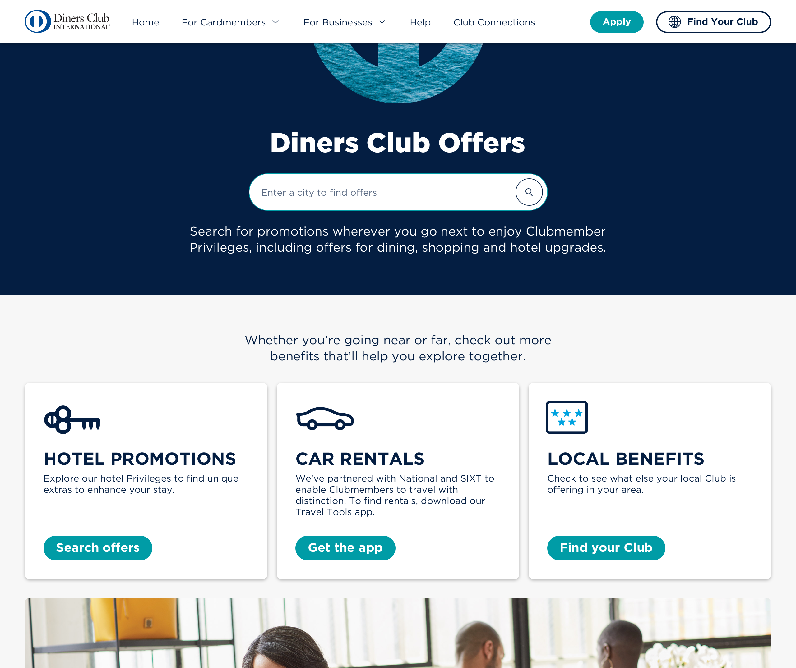
A integral part to the experience of the DCI website was the goal of providing users with the ability to search for all available benefits in a specific city; both for Diners Club Offers, as well as for Airport Lounges. This search functionality was a key factor in providing utility for users and driving their interaction with the site.
One of the more interesting challenges with this goal was creating the appearance of a site wide, benefits and lounges search functionality without having the actual capabilities of a single benefits search API. This was a necessary because the Airport Lounges Search API and the Offers Search API did not directly communicate with each other.
A creative and seamless solution was in order:
We decided to build a search capability which was nested within the Airport Lounges and Offers pages. While the search engines were separate we designed results pages which would allow the user to filter from both APIs. So that if a user was searching for an Airport Lounge in a specific city, they would be able to add Offers to their search results through a filtering system.

Once we had presented our designs and received final approval from the client, we engaged Centralis, a third party testing partner, to run our usability tests. I was responsible for the creation of a test plan as well as a robust Axure high fidelity prototype.
The initial goal of the test was to validate the site's search functionalities and filtering capabilities. Users were tested on two primary user task flows. The first, tested whether users could successfully navigate to and search for an airport lounge in a specific city. The second, tested whether users could succesfully search for and locate information on a specific offer for an upcoming trip.
Users were tested on their ability to navigate through these separate search flows. Users were also asked to relay their initial reactions to the site design, look and feel.
The pros: The site redesign was very well received. The site architecture and functionality for searching and filtering benefits and airport lounges was intuitive and useful. Users felt that the site provided extra value and were surprised at the breadth of functionality made available to them when it came to finding lounges and searching for offers. Overall, users were excited that they could rely on the DCI website to help them plan upcoming trips and see where their card was accepted abroad.
The cons: Users were confused by some of the navigation labels. Understanding the difference between the terms: Benefits and Offers required additional clarity for users. Navigation labels were refined through a card sorting exercise and updated to reflect usability learnings.


